
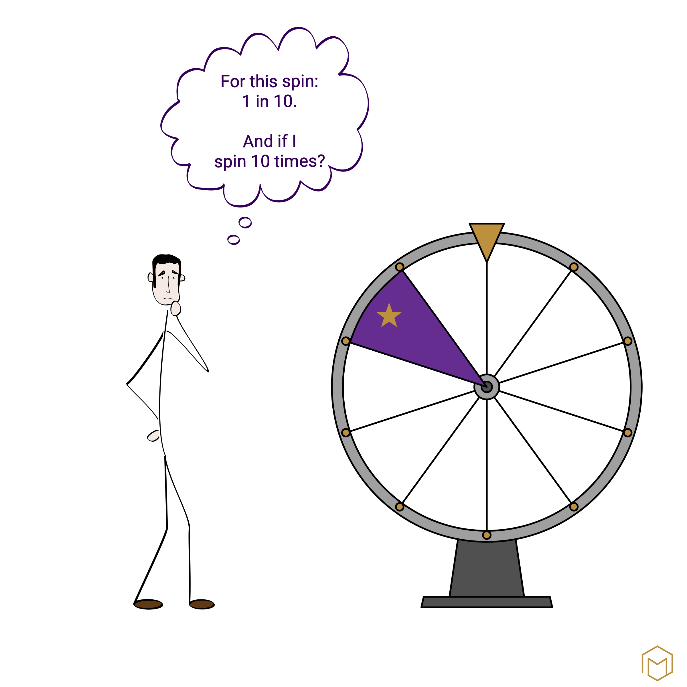
A high school student is playing a computer game and has to spin a wheel of fortune with 10 sections. The chance of winning is 1 in 10 per spin. His question: If he’s lost nine times, surely he’s bound to win eventually? No, I explain to him. The wheel has no memory. Each spin is independent. The chance of winning on the next spin remains 1 in 10.
He nods. Then he utters the crucial sentence: ‘I’ve understood that, but it’s counterintuitive.’
It is precisely this sentence that is the crux of the matter. Statistics are misunderstood because the human brain processes chance and probability in a way that contradicts the actual mathematical behaviour. This way of processing cannot be switched off simply by hearing the correct answer once. It remains counterintuitive.
What happens on the wheel of fortune
The student is falling prey to the gambler’s fallacy. This is the assumption that a random process has a ‘memory’ and must ‘even itself out’. After nine losses, a win must surely be on the cards, your gut feeling tells you. The wheel sees things differently.
Two different questions are being conflated here.
First question: Does my chance of winning increase on this one spin? The answer is no. It remains 1 in 10, regardless of how many times it has been spun previously.
Second question: Does my chance of winning at least once in ten spins increase? The answer is yes, to around 65 per cent. The maths behind this is as follows: the probability of losing on a single spin is 9 in 10. The chance of losing ten times in a row is the product of ten such individual spins: 9 in 10 to the power of 10. That works out at around 35 per cent. At least one win is the inverse of this, i.e. the remaining 65 per cent.
Both answers are mathematically correct. They simply answer different questions. Intuition throws them together, and that is where the confusion arises. The student is right: it remains counterintuitive, even once you’ve understood it.
An uncomfortable observation
What applies to students also applies to us adults. Researchers have repeatedly demonstrated that people struggle with statistics, probabilities and ratios. What struck me whilst reading the studies is that having an academic background does not protect against misinterpretations.
The brain overlooks the denominator. This is the most important mechanism, and it has a name: denominator neglect. People focus on the numerator of a ratio and neglect the denominator.
In 1994, Denes-Raj and Epstein demonstrated empirically just how strong this effect is.
Participants were given a choice between two bowls containing red and white jelly beans. They were allowed to take one out of one of the bowls with their eyes closed. If they picked a red one, they won a dollar; if they picked a white one, they came away empty-handed. They were shown beforehand that Bowl A contained 100 jelly beans, 9 of which were red. Bowl B contained 10 jelly beans, 1 of which was red.
Mathematically, bowl B is the better choice. 9 out of 100 gives a 9 per cent chance of winning, whilst 1 out of 10 gives a 10 per cent chance. Nevertheless, 61 per cent of the participants in the study chose bowl A. When asked why, they replied, in essence: ‘With bowl A, I have nine chances to win; with bowl B, only one.’ This statement is correct, but incomplete. It fails to take into account what is on the other side: the white jelly beans. In Bowl A, the 9 red ones have to stand out against 91 white ones. In Bowl B, the one red one is surrounded by 9 white ones.
What is remarkable is the participants’ self-reported information. They reported that, although they knew the odds were against them, they still felt as though they had better chances in the larger bowl. Intuition prevailed over knowledge.
The reason runs deep and also explains many other phenomena. People experience concrete numbers directly. The numerator is the tangible quantity that one can visualise. A ratio, on the other hand, is abstract and must be calculated. The fast, intuitive thinking system relies on the tangible number and skips over the abstract ratio. That is why ‘100 cases’ feels more threatening than ‘0.1 per cent’, even though both can mean the same thing.
Education provides no protection
This is the crucial point. These weaknesses do not disappear with a higher level of education. The ‘neglect’ factor is found in both laypeople and experts alike and cannot be remedied simply through practice.
The most convincing evidence comes from research into medical statistics. The result shook me to the core and has stayed with me ever since. Gerd Gigerenzer asked 160 experienced gynaecologists a question from their own field of expertise. The researcher phrased it in clear, everyday language, adding the technical terms only in brackets afterwards:
Suppose you are carrying out a breast cancer screening using mammography. You know the following about women in your region:
- The probability that a woman has breast cancer is 1 per cent (prevalence).
- If a woman has breast cancer, the probability that the test will be positive is 90 per cent (sensitivity).
- If a woman does not have breast cancer, the probability that the test will still be positive is 9 per cent (false-positive rate).
A woman receives a positive result. She wants to know from you whether this means she definitely has breast cancer, or what the probability of this is. What is the best answer?
The doctors did not have to do the maths themselves. They were given four options to choose from:
- The probability is around 81 per cent.
- 9 out of 10 women with a positive result have breast cancer.
- 1 out of 10 women with a positive result has breast cancer.
- The probability is around 1 per cent.
The correct answer is ‘1 in 10’. It was listed as one of the options. The doctors simply had to tick it. The majority did not. By far the most common choice was ‘9 in 10’ – nine times the actual figure. The estimates ranged across the entire scale, from 1 to 90 per cent.
And the mistake they made is remarkable. They answered the wrong question.
They were asked: How likely is it that there is cancer if the test is positive? However, their most common answer, ‘9 out of 10’, answers a different question. Namely: How likely is a positive test result if cancer is present? At first glance, both questions sound similar, but they differ massively. One goes from the test result to the disease; the other from the disease to the test result. The difference is a factor of ten and affects a woman who wants to know whether she is ill. Anyone who tells her the probability is 90 per cent is sending her into weeks of anxiety that are not justified statistically. Nine out of ten women with a positive result do not have cancer. But they only find this out after further tests, which can take weeks.
The figures in the study were simplified for educational purposes. In reality, the proportion of cancer cases among all positive test results is between 15 and 18 per cent. This means that, even with the actual figures, 1 in 10 remains the best option.
A high level of education implies in-depth specialist knowledge. Statistical literacy is rarely part of this, because it is simply never taught in most courses.
The solution lies in the format
People aren’t hopelessly bad at statistics. They’re bad at dealing with the abstract format of proportions. The same information, presented in the right format, becomes understandable.
In the same Gigerenzer study, the misjudgements made by most gynaecologists disappeared once they had been taught to translate conditional probabilities into natural frequencies. Instead of the abstract formulation ‘1 per cent base rate, 90 per cent sensitivity, 9 per cent false positives’, the concrete rephrasing:
- Out of 1,000 women, 10 have cancer.
- Of these 10, 9 are correctly identified by the test.
- Of the 990 healthy women, 89 produce a false-positive result on the test.
In total, there are 98 positive test results, but only 9 of these are cases of cancer. The probability that a positive result indicates cancer is 9 out of 98. That is just under 10 per cent.
Now you can work it out. Natural frequencies correspond to the way people have always processed information. Dividing by the denominator is the very step the brain is reluctant to take.
Using a new format, 87 per cent found the correct answer. What remains remarkable is the rest: 13 per cent – around 20 of the 160 doctors – failed to arrive at the correct answer even after the question had been rephrased.
And then there’s the language
Even if the questions are clearly separated and answered, a third level remains: language.
In 1977, the US Department of Defence set 23 experienced NATO officers a test. They were presented with statements about a possible Soviet invasion of Czechoslovakia. Each sentence contained one of the usual probability terms, such as ‘probable’ or ‘possible’. The task: translate the term into a percentage. How certain are you that the event will occur?
The answers varied widely. The phrase ‘highly probable’ was interpreted by some as 60 per cent certainty, by others as 90 per cent. For the word ‘likely’, the answers ranged from 40 to 95 per cent. ‘We doubt’ overlapped with ‘likely’. Experienced officers, trained in reading reports, interpreted the same words in fundamentally different ways.
A replication study from 2018 painted the same picture. ‘Real possibility’ was estimated to be between 20 and 80 per cent. Even with ‘impossible’, there were people who attributed 5 per cent to the word. For most terms, interpretations differ by 30 to 40 percentage points.
If two board members read the same report and one understands ‘likely’ to mean 60 per cent, whilst the other understands it to mean 90 per cent, they will make decisions based on different assumptions.
What this means for decision-making in the corporate world
A decision paper on an AI project in customer service is on the table. A supplier is presenting its system for automatic enquiry classification. The key figure in large print: 95 per cent accuracy. Sounds solid.
In terms of actual numbers, this means: out of one million customer enquiries per year, 50,000 are handled incorrectly. 50,000 customers whose concerns are not understood and who receive inappropriate information. The same fact, two different perspectives. The percentage format is reassuring; the frequency format is alarming. And it allows for an honest comparison between the number of errors and their consequences, the resources required to rectify them, and the benefits of the solution.
Try it for yourself. The next time you come across a percentage figure, translate it into concrete numbers. How many people, processes or cases does that represent in absolute terms? How does that figure strike you?